ShipTection Website Revamp

A conversion-focused UI/UX redesign and modular design system engineered to turn post-purchase shipping friction into an authoritative B2B revenue driver for Shopify merchants.

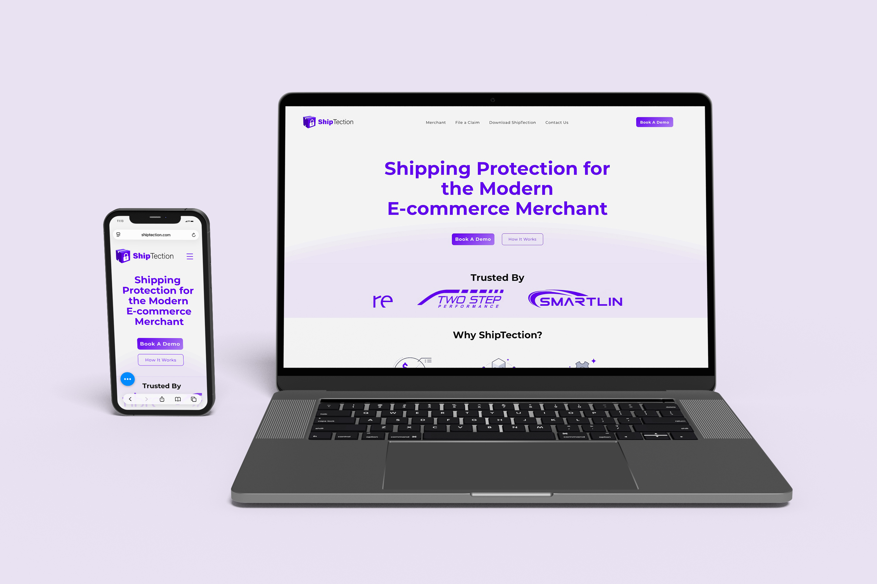
ShipTection responsive web design displayed across MacBook Pro and iPhone screens
STRATEGIC FOUNDATIONS

From Friction to Conversion

Aligning merchant acquisition incentives with clear customer protection to drive measurable pipeline growth.

The Challenge

Low Trust & Conversion Drop-Off

When e-commerce founders landed on the legacy site, they could not figure out whether ShipTection was an insurance tool or a consumer app. Critical merchant math (how package protection turns lost parcel headaches into net revenue) was buried under walls of text. High bounce rates were killing demo bookings.

The Solution

Brand Authority & Conversion Flow

We split the experience into two distinct tracks: clear revenue modeling for Shopify store owners, and a fast, low-friction claims portal for shoppers. Fixed sticky navigation keeps demo links in view, while interactive pricing calculators demonstrate exact dollar returns before a merchant even books a call.

COMPARATIVE ANALYSIS

Before & After Exhibition

A direct contrast highlighting structural improvements, cognitive clarity, and conversion mechanics between the legacy platform and the redesigned experience.

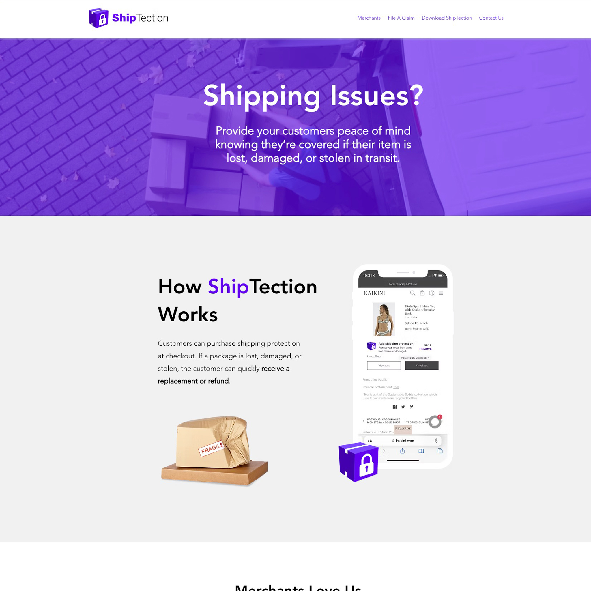
Before // Legacy Site Cluttered & Passive
Legacy ShipTection landing page exhibiting weak CTA placement and cluttered imagery

Identified Friction Points

  • Vague Positioning: "Shipping Issues?" framed the service as a reactive consumer problem rather than a merchant revenue driver.
  • Missing CTAs: Zero calls to action in the header or hero fold left visitors without a clear path forward.
  • Zero Social Proof: No merchant partner logos or trust credentials above the fold to validate adoption.
  • Visual Clutter: Uncalibrated device graphics and fragmented imagery weakened overall brand credibility.
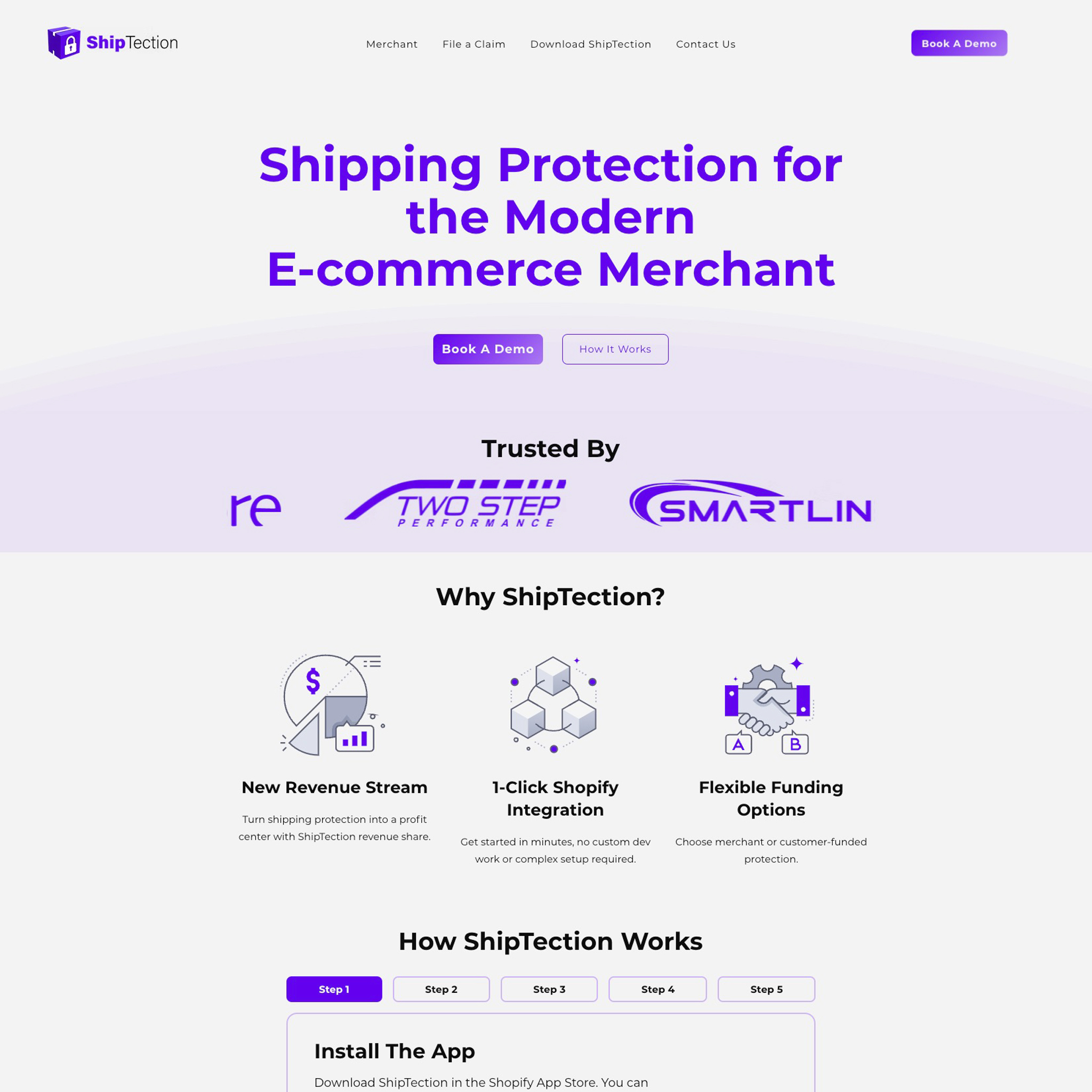
After // Redesigned Site Focused & Action-Driven
Redesigned ShipTection landing page with clear CTA hierarchy and modern layout

Engineered UX Solutions

  • Targeted B2B Value Prop: Authoritative headline speaking directly to modern e-commerce merchants.
  • Persistent Dual CTAs: High-visibility "Book A Demo" and "How It Works" anchors in the header and hero.
  • Instant Social Proof: Dedicated "Trusted By" marquee showcasing validated Shopify merchant brands.
  • 5-Step Guided Onboarding: Interactive progressive tabs clearly mapping app installation to automated claims.
INFORMATION ARCHITECTURE

Blueprint & User Journey Mapping

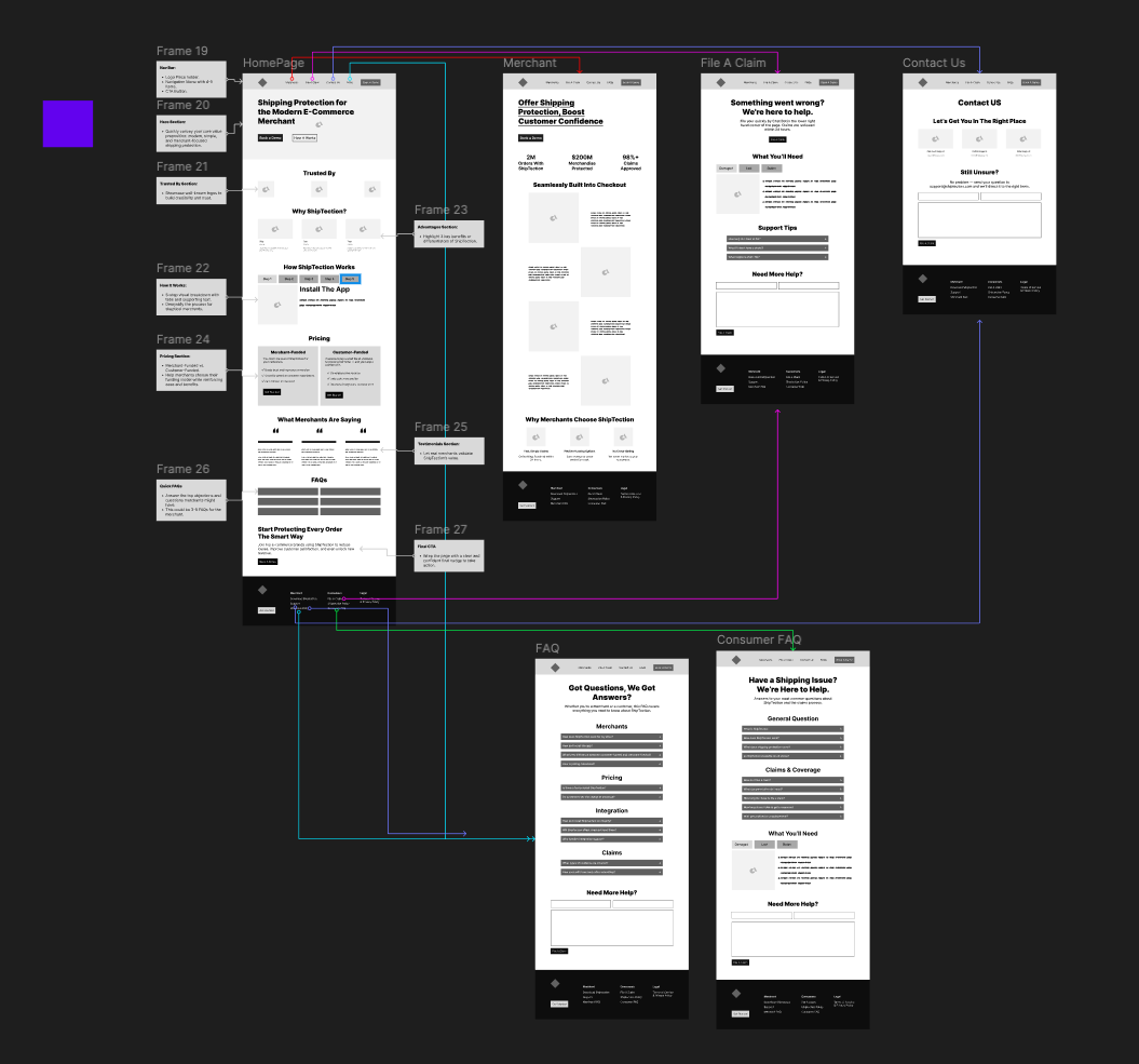
Establishing intuitive navigation architecture, persona segregation, and conversion pathways across six core site destinations before high-fidelity visual styling.

ShipTection structural wireframes mapping user flows across Homepage, Merchant ROI, Claims Processing, and FAQs
Persona Segregation

Dual Audience Pathways

Separated merchant acquisition flows from end-consumer claims processing. Merchants get immediate ROI data and demo funnels; shoppers receive a frictionless claim filing interface without cluttering the B2B marketing journey.

Persistent Wayfinding

Sticky Navigation Core

Engineered a fixed header and anchored sub-navigation that keeps essential touchpoints (Shopify App installation, merchant portal, claim filing, and demo requests) accessible across all scroll depths.

Modular Taxonomy

Scalable Component Blocks

Standardized reusable content modules across the homepage and merchant landing pages, including dynamic revenue share calculators, 3-pillar benefit cards, and searchable FAQ accordions.

DESIGN RATIONALE

Why It Works: The 6 Conversion Pillars

Strategic UI and UX principles engineered to reduce cognitive friction, establish instant merchant authority, and accelerate app adoption.

Pillar 01

Strategic CTA Placement

Key conversion actions like booking a demo or installing via the Shopify App Store stay within thumb reach. Merchants never have to scroll backwards to figure out how to get started.

Pillar 02

Sticky Navigation Core

The condensed header anchors claims lookup for buyers and demo booking for merchants, keeping both audiences moving forward without crowding the fold.

Pillar 03

Scannable Hierarchy

Store owners scan, they do not read. Bold section anchors and upfront metric callouts let busy operations directors absorb the financial upside in five seconds flat.

Pillar 04

Intentional Negative Space

We cleared out decorative widgets and let generous spacing do the heavy lifting. High-contrast typography and clear benefit cards now command full attention.

Pillar 05

Progressive Flow & Focus

Instead of sending leads through five separate subpages, interactive calculators and onboarding tabs let founders model their exact revenue share right on the main fold.

Pillar 06

Mobile-First Parity

Built from day one for founders checking stats on their phones. Touch targets exceed 48px, drawer menus open instantly, and complex data tables collapse into clean, readable cards.