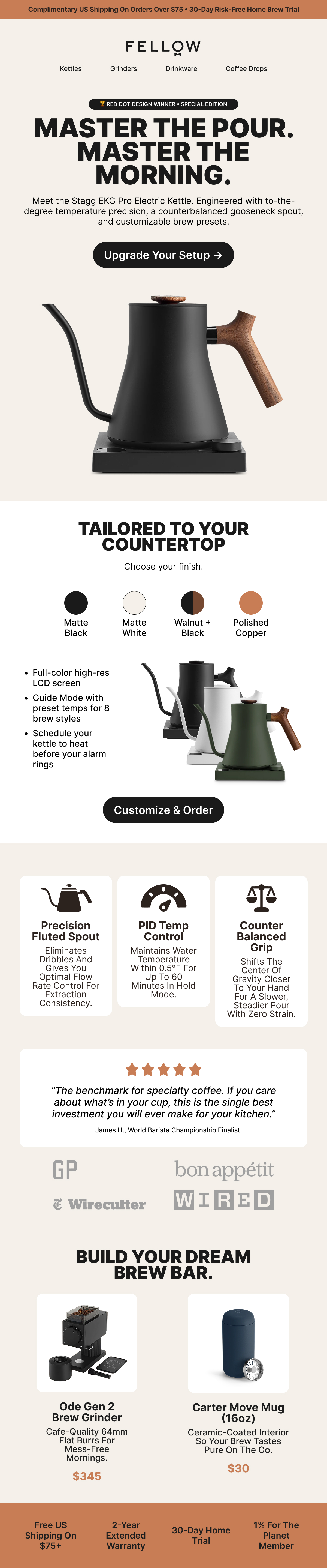
Specialty gear lives and dies by touch. Selling a $195 gooseneck kettle inside a cramped mobile inbox means preserving Fellow's quiet countertop elegance without turning the email into an unreadable wall of text. Coffee geeks want granular hardware specs, PID temperature regulation, weighted counterbalance handles, and custom maple accents, but casual gift buyers get scared off by spec sheets. The tension came down to pace: keeping enough negative space for the matte black silhouette to breathe while organizing dense technical details so subscribers actually scrolled down to the buy button.
Objective & Vision
The Goal
Build an editorial launch email that feels more like an interior design magazine than a discount blast. I anchored the hero section around the morning pour-over routine, framing the Stagg EKG Pro as the centerpiece of a daily ritual. From there, a modular tier system breaks down the micro-specs, walks through custom walnut and matte finishes, and introduces add-on drippers before anyone hits friction. The whole flow nudges readers from daydreaming about better morning brew quality straight into configuring their own setup.
6 Core Pillars
Design Highlights
Hierarchy
Mobile First
Most morning newsletters get opened bleary-eyed on a phone before someone even climbs out of bed. Single-column stacked geometry keeps copy wide and thumb targets generous, preventing mis-taps on small screens.
Aesthetic
Brand Consistency
Oatmeal canvas tones paired with deep matte obsidian. We mirrored Fellow's physical packaging cues and architectural studio lighting so the campaign feels native to their hardware catalog.
Information Architecture
Visual Readability
Quick scans beat heavy reading every time. Crisp technical line icons anchor a clean three-column matrix, letting pour-over enthusiasts verify flow dynamics and PID accuracy in under three seconds.
Interaction
Responsive Rendering
Interactive swatch modules let recipients preview matte black, warm stone, and wooden accents directly inside the message, cutting down bounce rates before shoppers hit the Shopify cart.
Conversion
Focused CTA
Buttons show up exactly where reader curiosity peaks, never stacked together in panic. We routed lifestyle browsers toward feature breakdowns and ready buyers directly to checkout with zero hesitation.
Performance
Fast Loading
Crisp retina assets crushed down to light payload weights. Tables render cleanly across notoriously picky Outlook engines, Gmail web view, and Apple Mail without broken slices or blurry icons.