
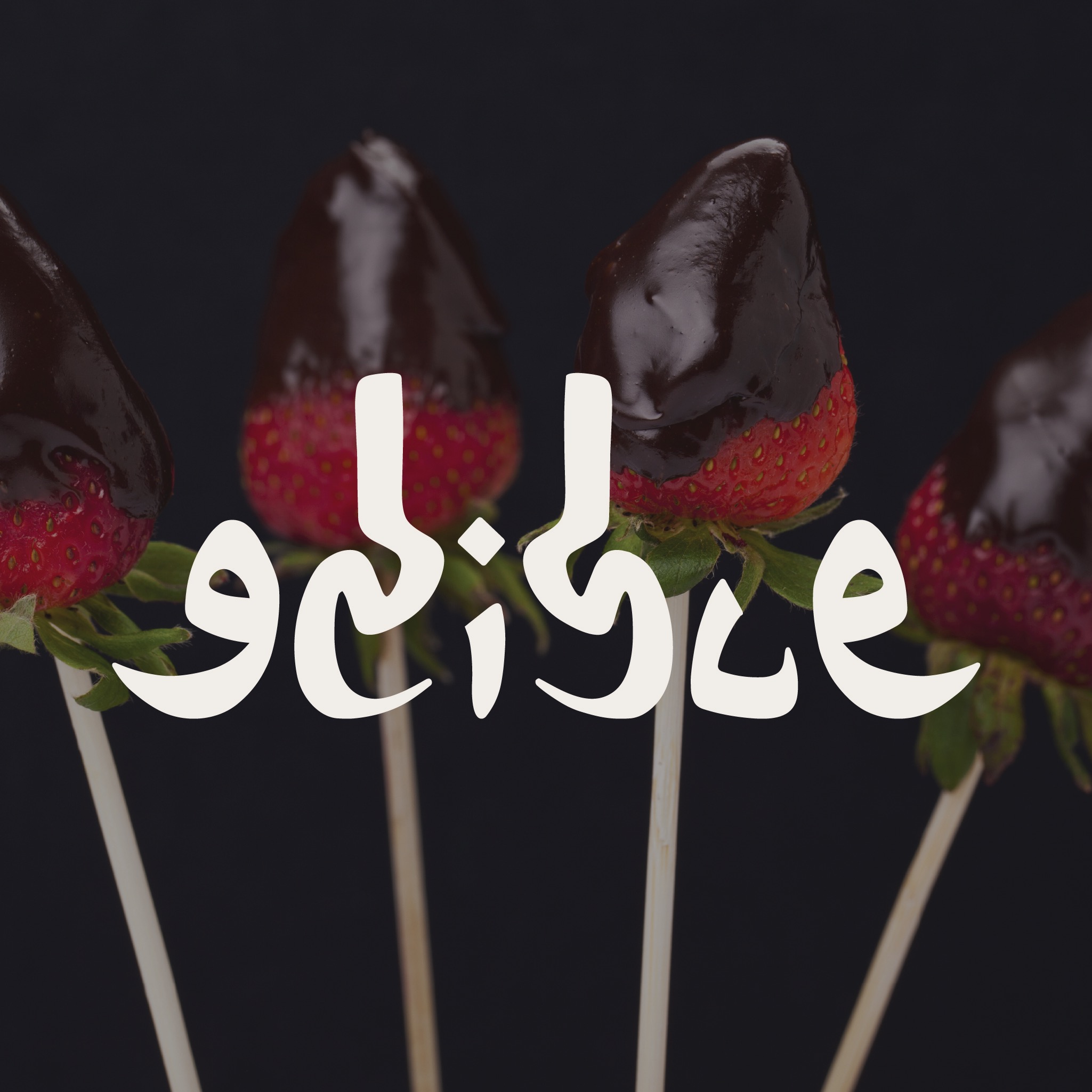
Edible Arrangements Redesign
Everyone remembers Edible from childhood holiday tables: melon skewers cut into daisies and crinkly cellophane. Over the years, their kitchen expanded into artisan chocolates, fresh baked goods, and handcrafted bouquets, but the brand was still perceived as an occasional novelty.
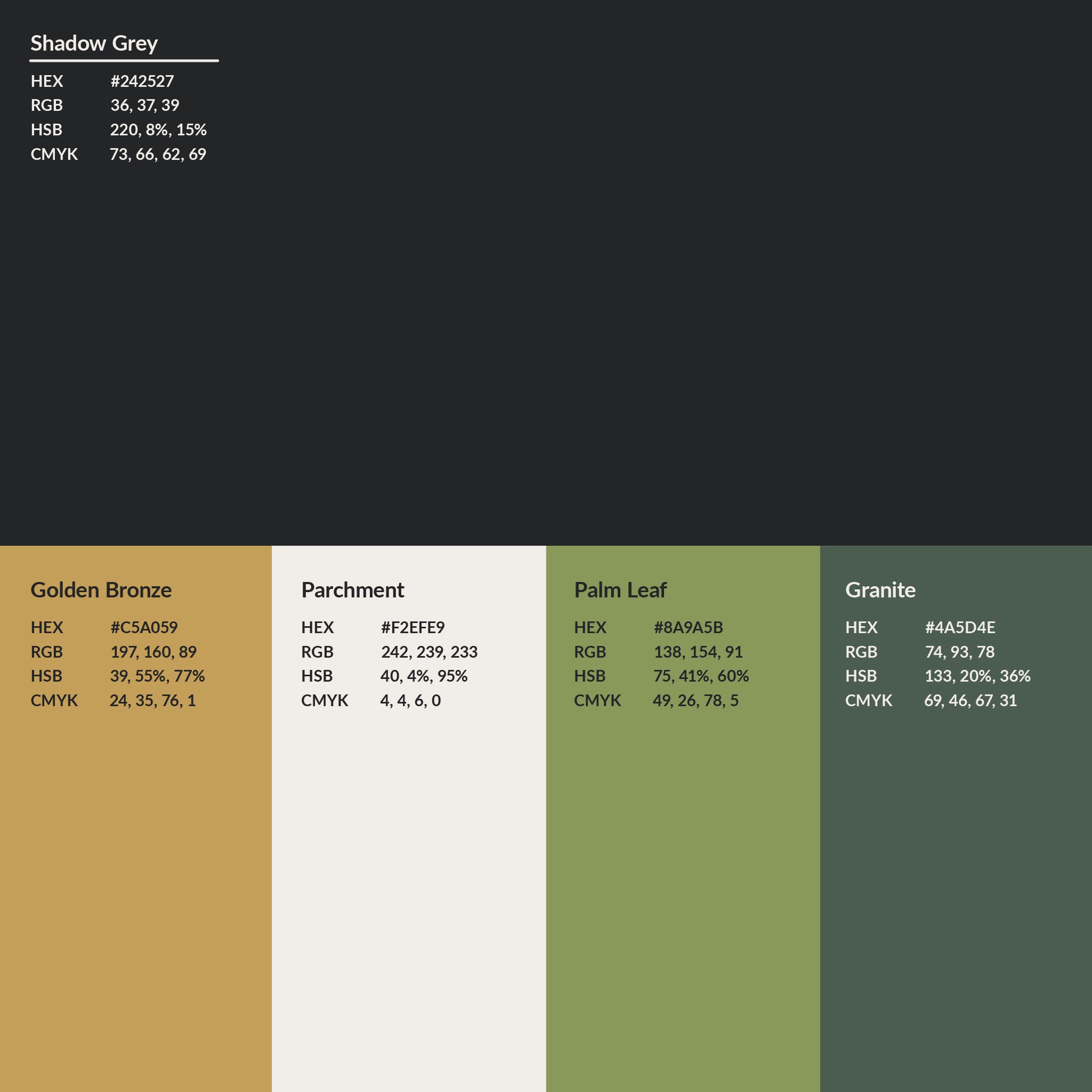
The design challenge was guiding that evolution without alienating decades of goodwill. We rebuilt the identity from the ground up to establish Edible as a year-round luxury gifting destination, pairing warm botanical hues with packaging that feels genuinely elevated.
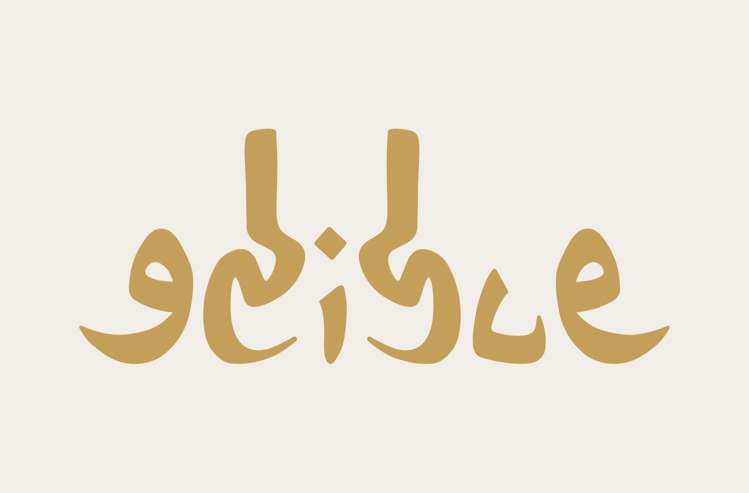
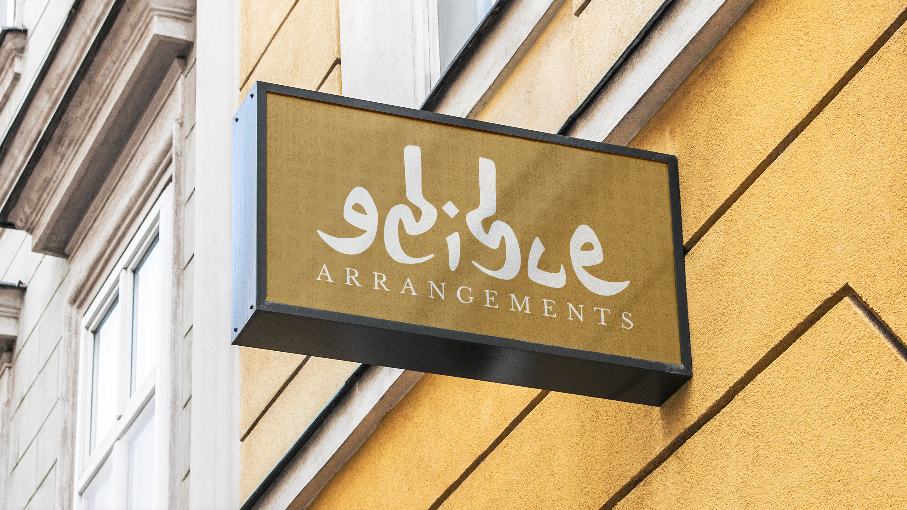
Logomark Evolution & Color System
We retired the busy legacy fruit illustration in favor of a clean, sculpted silhouette. The new emblem merges the curvature of fresh fruit with an unfolding petal, creating an organic mark that embosses cleanly on textured paperboard and scales down smoothly to mobile screens.

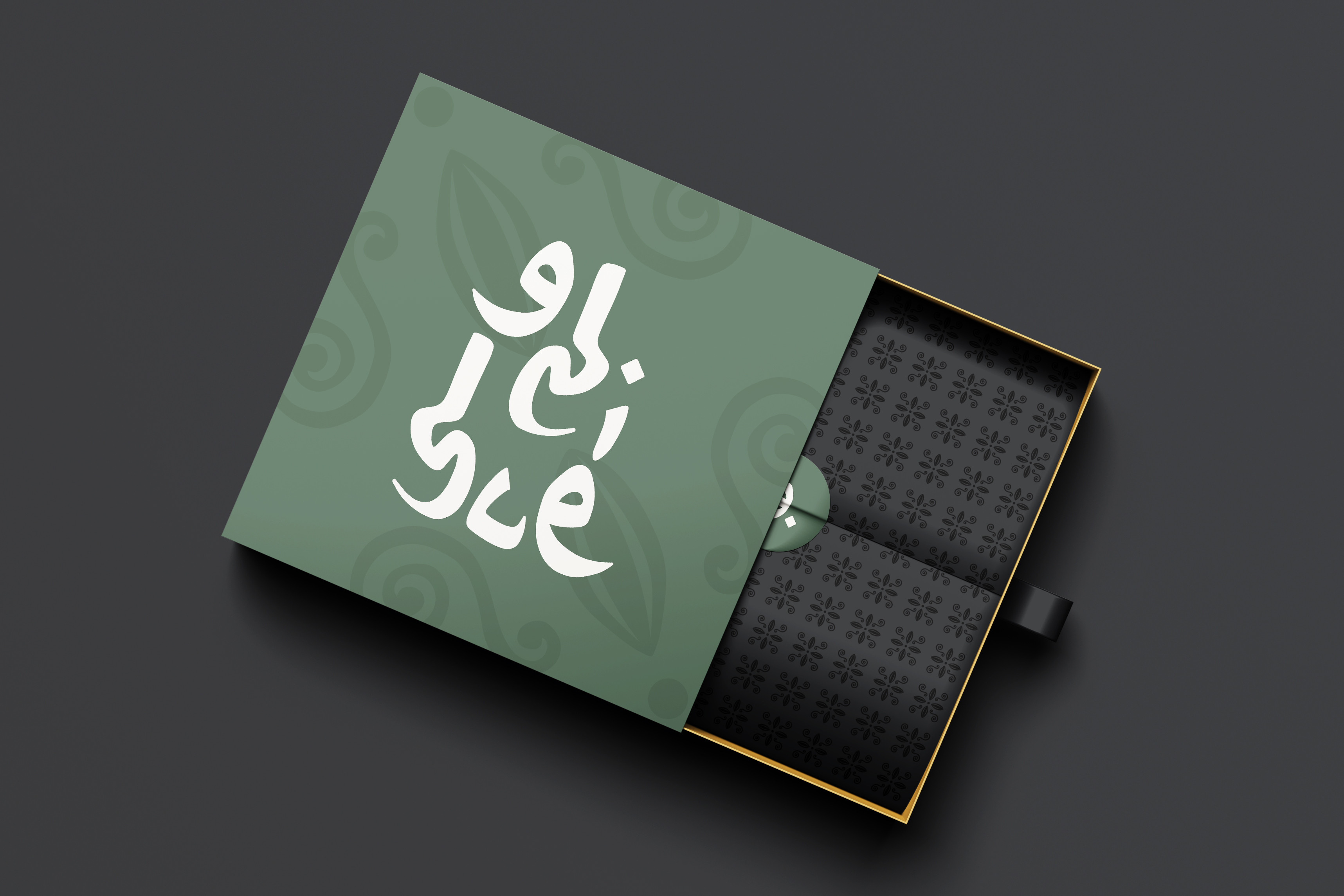
Luxury Packaging Experience
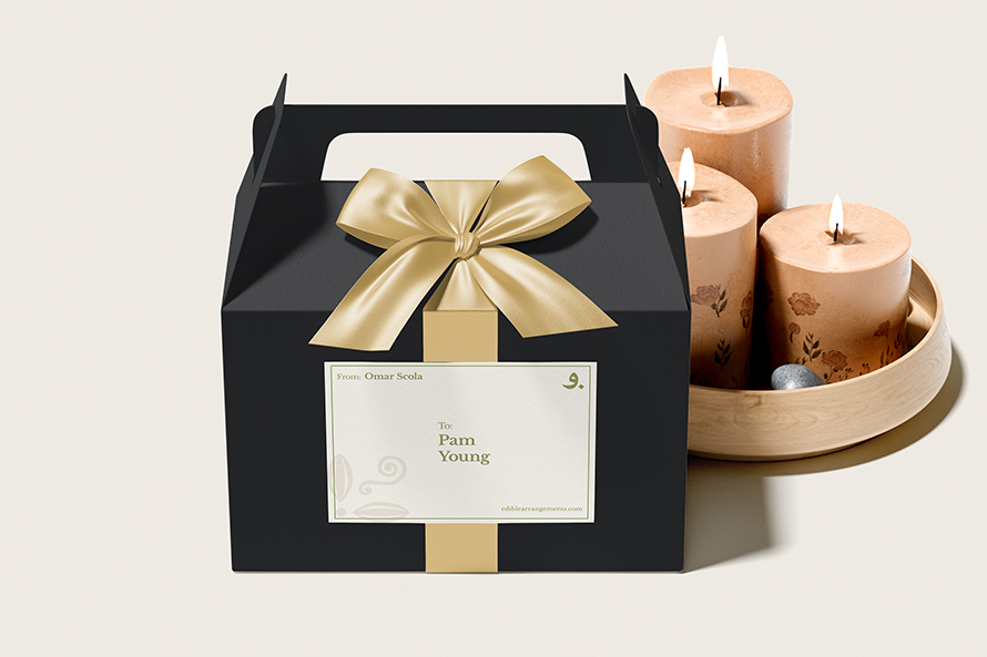
When someone receives a gift, the unboxing sets the entire emotional tone. We chose heavy-board rigid stock, deep forest green surfaces, and warm metallic accents, giving every delivery the weight and polish of a high-end luxury surprise.
Brand System & Digital Touchpoints
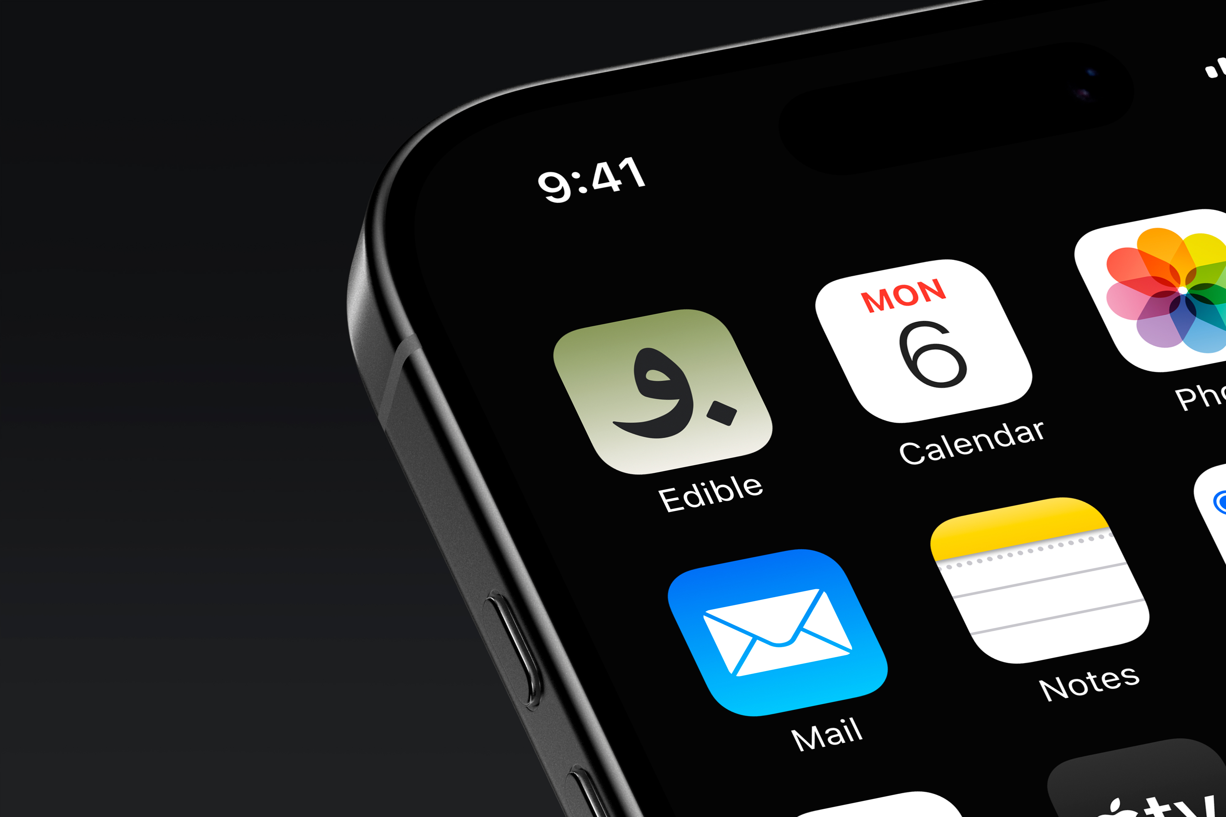
From secondary seals to mobile digital interfaces, the identity maintains consistency and warmth across every customer interaction. The mobile icon and typographic standards ensure the rebrand scales cleanly from handheld screens to retail store displays.

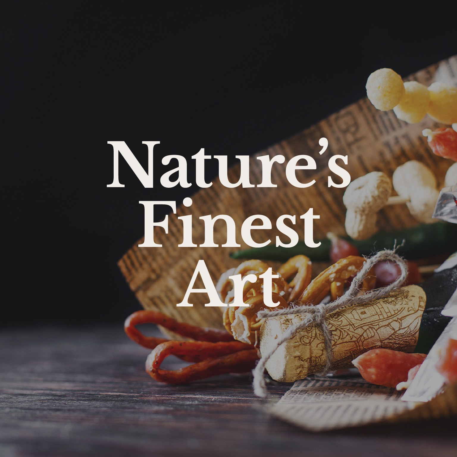
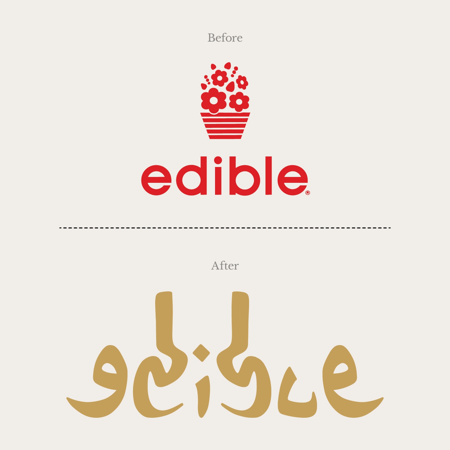
A great rebrand does not erase where a company came from. It strips away dated visual noise so customers can see what the brand has grown into.
By treating physical packaging and digital storefront flows with equal care, the new identity ensures every milestone, from a quick thank-you box to an anniversary centerpiece, feels personal and considered.