
Guard Pro
Table tennis branding often gets stuck between cheap rec-room toys and stuffy heritage gear. GuardPro entered the market to treat the sport like the high-speed, technical athletics it actually is.

Brand Identity & Typography
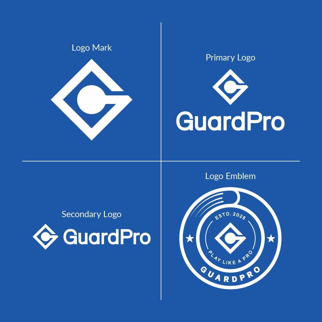
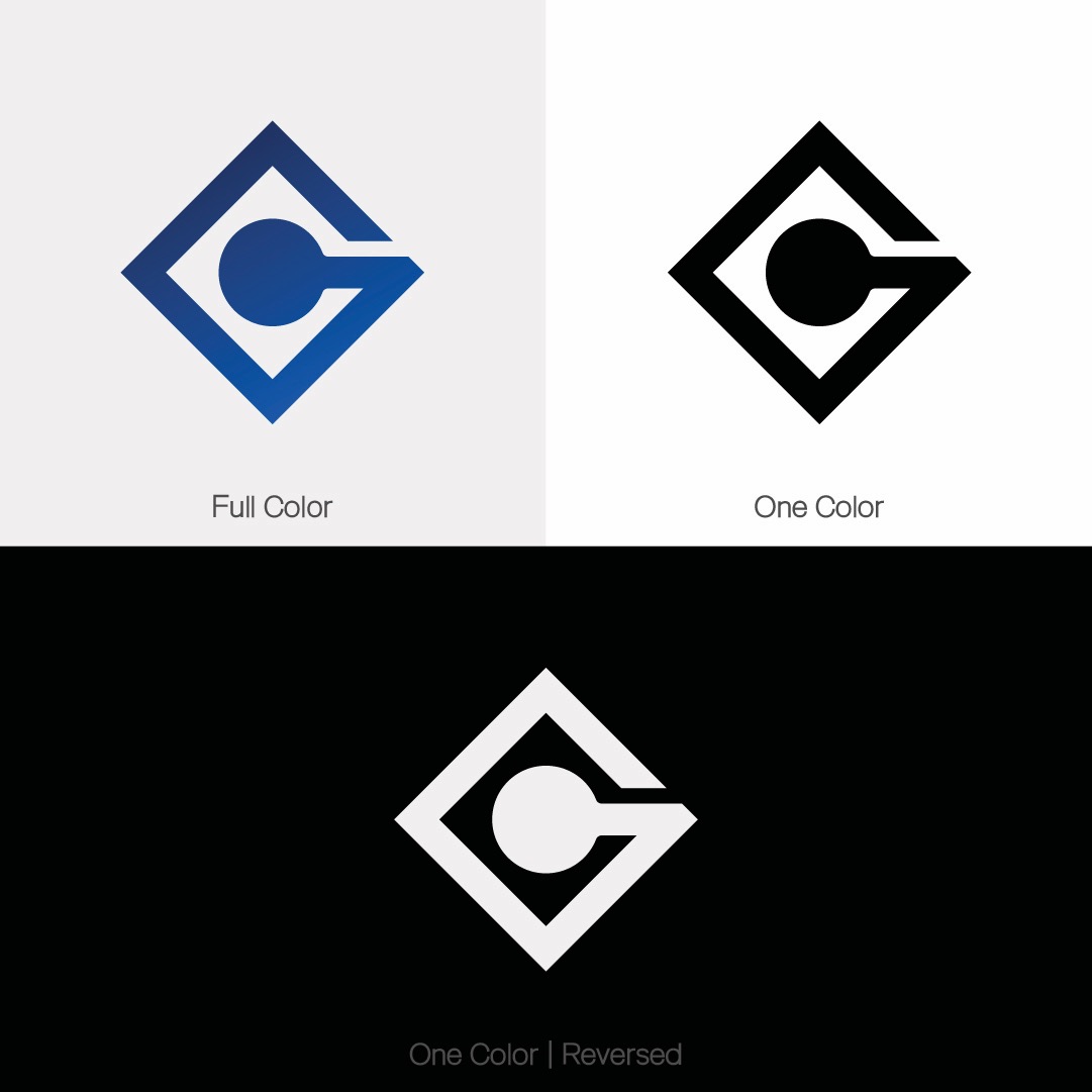
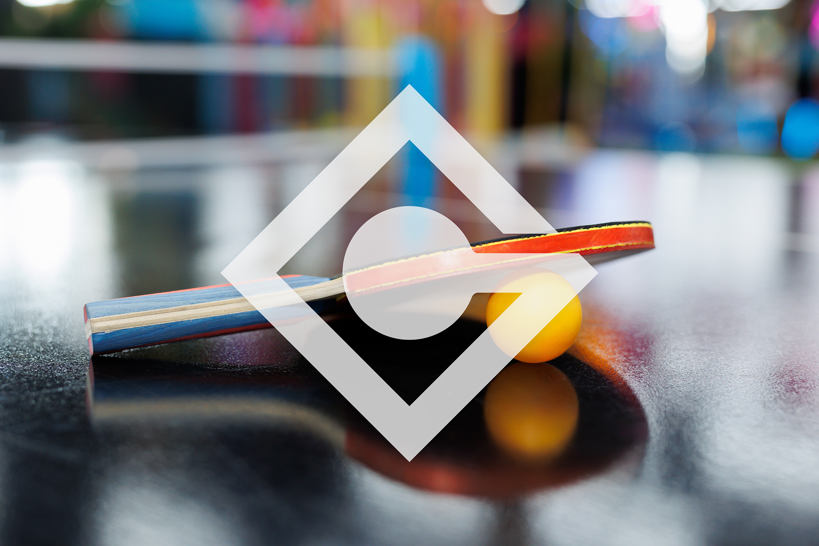
The monogram fuses an angled blade with a defensive shield. Drawn on strict diagonals, the silhouette holds up cleanly whether stamped onto rubber paddle edges or blown up across arena walls.
Tactical Tournament Performance
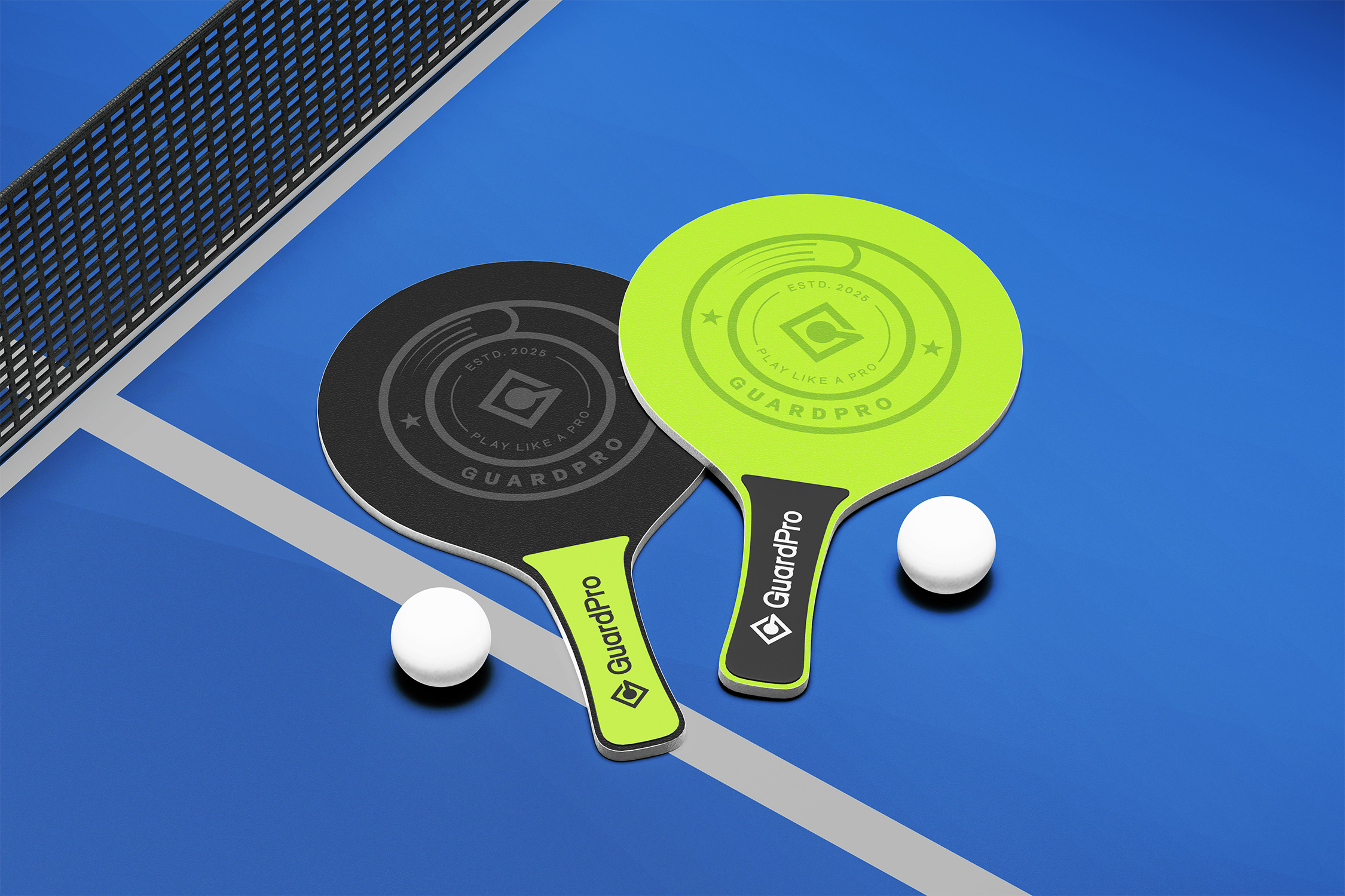
Serious players judge gear with their hands first. We extended the identity through tactile carbon fiber textures, matte rubber edge tape, and high-visibility tournament packaging.
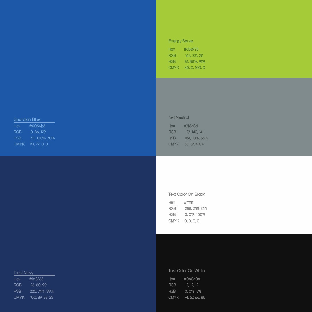
Guardian Blue and deep navy establish institutional tournament authority, while energetic lime-yellow highlights echo the speed of tournament rallies.
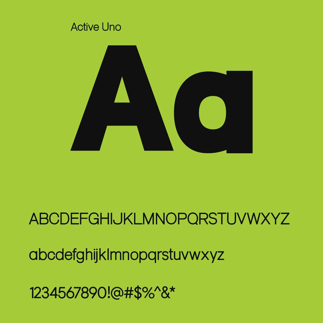
The custom Active Uno letterforms feature forward-leaning terminals that remain legible whether laser-etched onto a blade handle or broadcast across scoreboard feeds.