

Pixel Arcade
Logging video games usually feels like doing inventory in a spreadsheet. Pixel Arcade set out to change that by turning collection tracking into something players actually look forward to using between match queues.
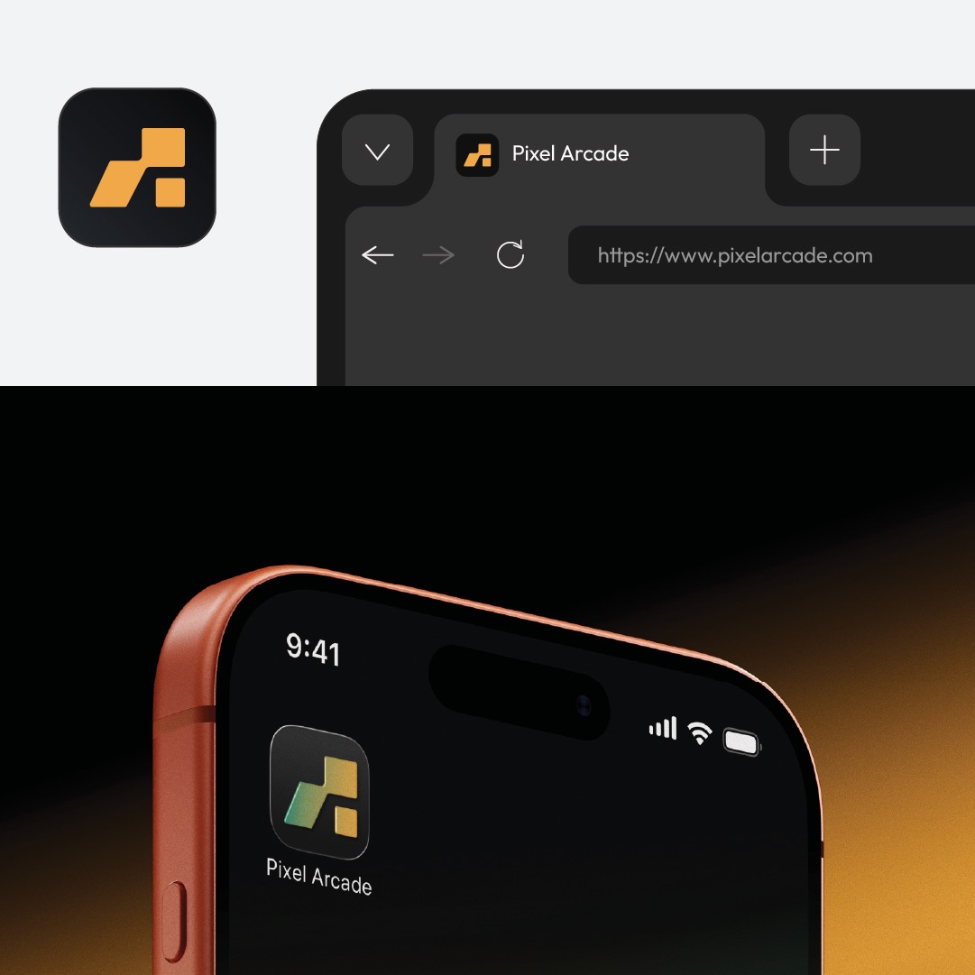
I led the brand build from the ground up, including the name, primary logomark, and mobile UI framework. The goal was simple: evoke the thrill of late-night arcade cabinets without turning into an outdated retro parody.

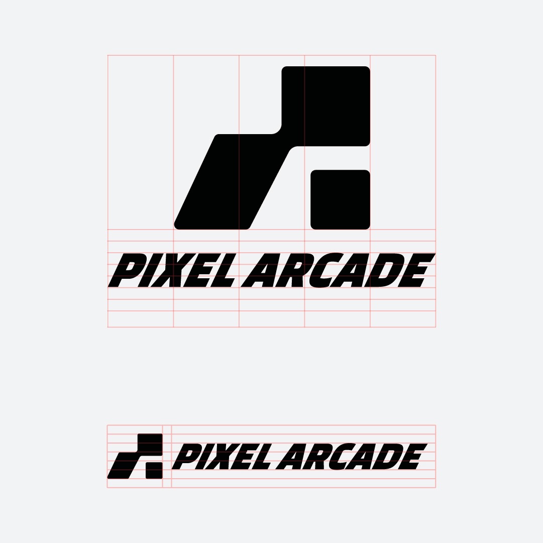
Logomark Craft & Typographic Energy
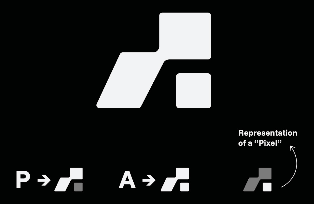
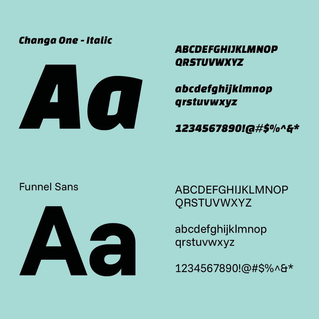
The core mark draws directly from old-school cabinet marquees and 16-bit sprite grids. Squared letter counters, 45-degree bevels, and high-contrast violet give the typography real weight, staying crisp even at sixteen pixels on a smartphone status bar.
Retro-Inspired System & Mobile Experience
Most gaming platforms get cluttered the second community features get added. We kept the mobile interface stripped back, letting high-visibility magenta badges and bold headers guide users through dense game lists without visual fatigue.
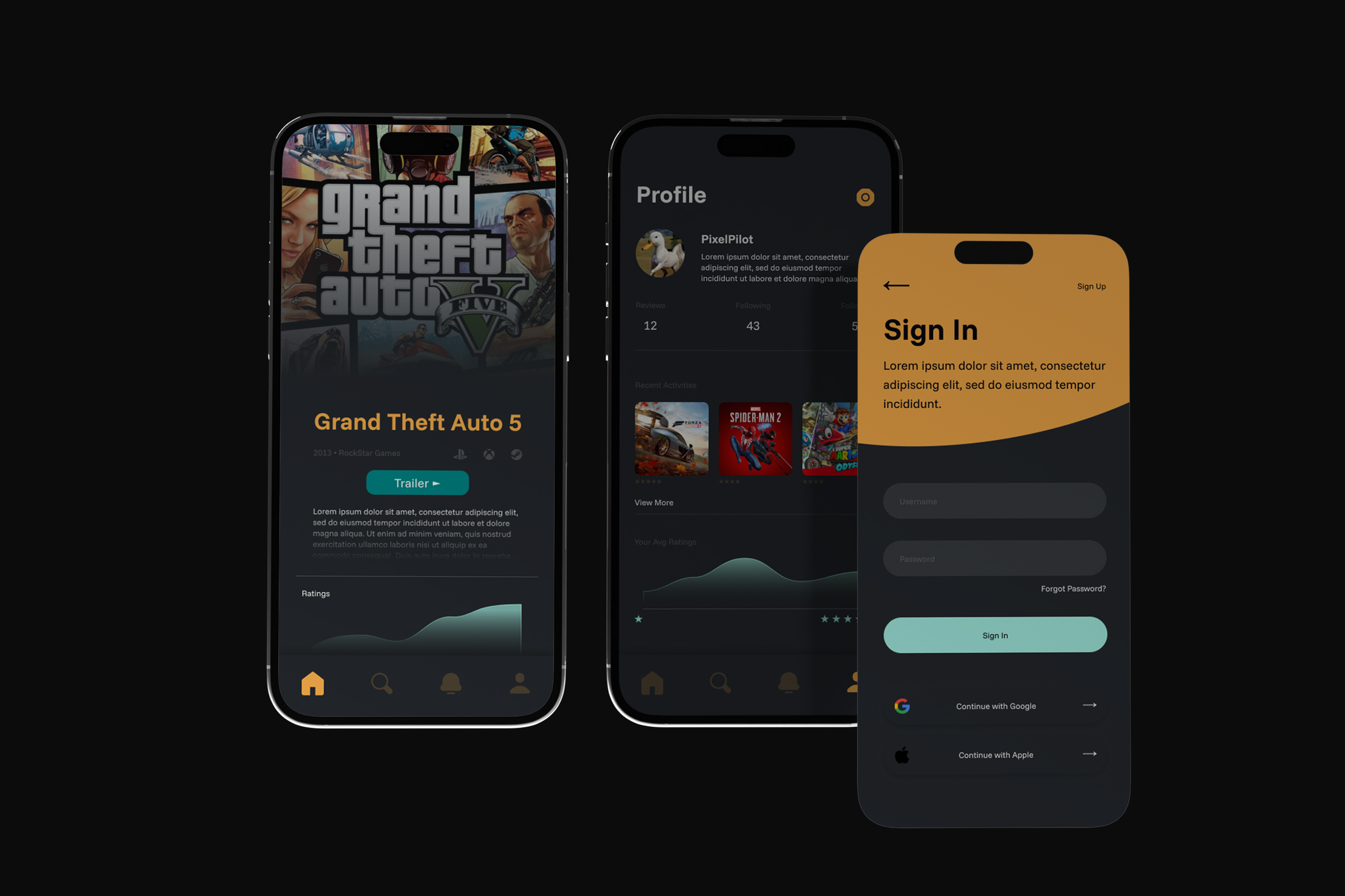
Tracking your backlog should feel rewarding. Every review submitted or badge unlocked gives users immediate visual feedback, transforming routine data entry into an interactive loop.
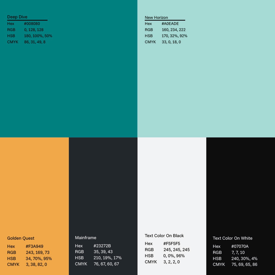
Pairing vibrant magenta against deep obsidian black keeps the screens comfortable during late-night gaming sessions, while geometric seals give community profiles genuine collectible appeal.